
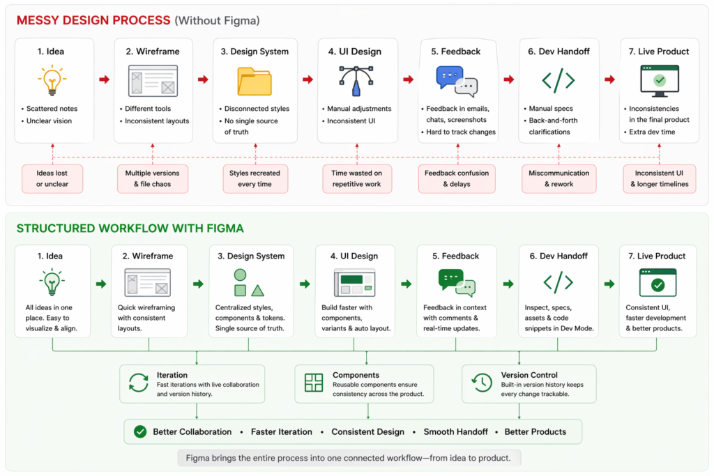
Where design workflows actually break
The biggest problem in design isn’t creativity—it’s translation.
You design something that looks right. Clean layout, consistent spacing, everything aligned.
Then things start to drift:
- The developer builds something slightly different
- Spacing feels “off,” but no one can point to why
- A small change breaks multiple screens
- Feedback arrives too late—when fixing it is expensive
I’ve seen projects slow down not because the design was bad, but because the system behind the design couldn’t handle change.
Before seriously using Figma, I thought the issue was communication.
In practice, the real issue was this:
Most tools don’t connect design decisions to execution.
Figma does, but only if you use it correctly.
In this guide, I’ll show you:
- What actually happens when you use Figma on real projects
- Where it breaks down (and why most teams misuse it)
- The non-obvious workflows that make it significantly more powerful
What Figma Actually Does
At its core, Figma is not just a design tool, it’s a shared interface layer between designers, developers, and stakeholders.
In plain terms:
- You design interfaces
- Others interact with them in real-time
- Decisions stay attached to the design itself
Who it’s for:
- Designers building scalable UI
- Teams shipping digital products
- Freelancers managing client feedback loops
What problem it solves (in reality):
Not “design creation” – but design consistency under change
When it works best:
- Iterative products (SaaS, apps)
- Teams with ongoing collaboration
- Systems that evolve over time
When it breaks down:
- One-off design tasks (overkill)
- Teams without structure
- Designers who treat it like Photoshop
Real insight
At first, I thought:
“Figma will make me faster.”
In practice:
It made me slower at the beginning – but far more consistent over time.
That trade-off is the whole point.
Key Features (With Real – World Depth)
1. Real-Time Collaboration
What it does:
Multiple people editing the same file.
What actually happens in practice:
- Designers step on each other’s work
- People move things without context
- “Quick fixes” create inconsistencies
Why it matters:
Speed increases – but so does risk of chaos
Non obvious tip:
Create a rule:
One person owns structure, others suggest changes via comments
2. Components & Variants
What it does:
Reusable UI building blocks.
What actually happens:
- Teams create too many components
- Slight variations multiply uncontrollably
- Naming becomes inconsistent
Insight:
A bad component system is worse than none.
Better approach:
- Start small (buttons, inputs, cards)
- Expand only when repetition is proven
Hidden limitation:
Variants can become slow and confusing in large systems.
3. Auto Layout
What it does:
Makes layouts responsive.
What actually happens:
- Beginners fight Auto Layout
- Advanced users rely on it heavily
Turning point I noticed:
Once I stopped “positioning pixels” and started “defining rules,” everything clicked.
Non-obvious tip:
Think like a developer:
- Padding
- Flex direction
- Alignment
Not:
- X/Y positioning
4. Dev Mode
What it does:
Gives developers specs.
Reality:
Developers don’t blindly trust it.
Why:
- Inconsistent spacing
- Mixed styles
- Poor naming
Insight:
Dev Mode doesn’t fix bad design structure, it exposes it.
Better workflow:
- Clean layers before handoff
- Use consistent spacing tokens
- Avoid “magic numbers”
5. Prototyping
What it does:
Simulates interactions.
Where it shines:
- User flows
- Client demos
Where it fails:
- Complex logic
- Realistic app behavior
Non obvious tip:
Use prototyping to test decisions, not impress people.
How to Use Figma (Real Workflow)
Real Project: SaaS Dashboard
Step 1: Wireframe (Fast, Not Pretty)
I blocked:
- Sidebar
- Header
- Content zones
Mistake:
Spent too much time aligning early.
Better approach:
Speed > precision at this stage
Step 2: Define Structure First
Before styling, I created:
- Layout containers (Auto Layout)
- Spacing rules
This changed everything.
Step 3: Build Minimal Components
Instead of designing everything:
- Button
- Input
- Card
Mistake I made before:
Creating 15 components upfront
Fix:
Create components only after repetition appears
Step 4: Apply Styles Systematically
- 8px spacing system
- Defined typography scale
What happened:
Everything became predictable
Step 5: Prototype Early
Not at the end.
Why:
Catches flow issues before visual polish
Step 6: Controlled Feedback
Instead of:
“Tell me what you think”
I asked:
- “Does this flow make sense?”
- “Is anything unclear here?”
Result:
Better feedback
Common Beginner Mistake
Mistake:
Designing screens independently
Problem:
No system → inconsistencies
Fix:
Design relationships, not screens
Real Life Use Cases (With Honest Insights)
1. Freelance Client Work
Reality:
Clients don’t care about your components
What works:
Clickable prototypes
What fails:
Over-explaining design systems
2. Startup MVP
Reality:
Speed matters more than perfection
What works:
Loose system + fast iteration
What fails:
Over engineering components early
3. Scaling Product Teams
Reality:
Consistency becomes critical
What works:
Strict component governance
What fails:
Uncontrolled editing access
4. Designer – Developer Collaboration
Reality:
Misalignment still happens
What works:
Discussing edge cases early
What fails:
Assuming Dev Mode solves everything
Example Outputs
| Task | Without Structured Tooling | With Figma (Used Properly) |
|---|---|---|
| UI Consistency | Varies across screens | Controlled via components |
| Feedback | Scattered, delayed | Centralized, contextual |
| Dev Handoff | Interpretation-based | Spec-driven (if clean) |
| Iteration | Risky, slow | Controlled, scalable |
Pricing (With Strategy)
| Plan | Reality Check |
|---|---|
| Free | Enough for solo work, limited for teams |
| Professional | Where real value starts |
| Organization | Only worth it at scale |
Real mistake to avoid:
Paying for advanced plans without:
- Using components
- Using team libraries
You won’t see ROI.
Pros and Cons (Honest)
Pros
- Best-in-class collaboration
- Strong system design capability
- Reduces design-dev friction
- Scales well (if structured)
Cons
- Easy to misuse
- Requires discipline
- Performance drops in large files
- Not ideal for visual-heavy design
Who Should Use It
Best for:
- Product designers
- Teams building scalable UI
- Freelancers working iteratively
Not for:
- Static graphic design
- One-off visuals
- Users unwilling to learn systems
Advanced Tips (Non-Obvious)
1. Design for Change, Not Perfection
Your design will change. Build for that.
2. Limit Component Depth
Deep nesting = harder debugging
3. Use “Ugly First Pass”
Structure > aesthetics early
4. Audit Your File Weekly
Things break silently in Figma
5. Treat It Like Code
- Structure matters
- Naming matters
- Systems matter
Final Verdict
Figma is powerful, but only if you stop using it like a drawing tool.
The real value:
Not speed.
Not visuals.
But control over complexity.
Is it worth it?
Yes, if you:
- Build evolving products
- Work with developers
- Care about long-term scalability
Clear recommendation:
Use Figma when your design needs to survive change, not just look good once.
FAQ
Is Figma enough on its own?
Yes for UI design, but not for full product workflows.
Why do some teams struggle with Figma?
Because they skip structure and jump to visuals.
Is Figma good for beginners?
Yes, but only if you learn systems early.
Does Figma replace developers?
No. It just reduces ambiguity.
Call to Action
Don’t just open Figma and start designing.
Instead:
- Build a small system
- Create 3 – 5 reusable components
- Test a real workflow with feedback
That’s where Figma stops being a tool, and starts becoming an advantage.